Knox County, Ohio Rebrand
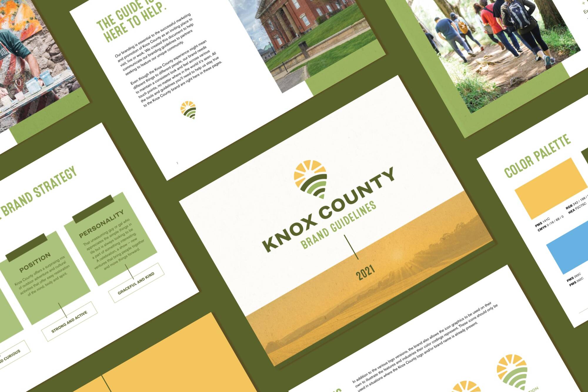
A brand refresh for Knox County, a town located in the heartland of Ohio. A destination to reconnect with your passion, discover a new way to explore and find a peace that you didn't know was missing.
Client
Knox County Visitors Bureau
Year
2020
Services
• Brand Identity Design
• Promotional Design
Notes
Created at Fahlgren Mortine
CD / Bill Fiorito
Discover the unexplored
and unexpected
Knox County, Ohio holds a surprising mix of outdoor adventure and cultural activities that offer easy restoration of the mind, body, and spirit. The brand needed a new mark that represented both the ample opportunities that have arisen in the past 20 years as well as the history formed in the previous 200.
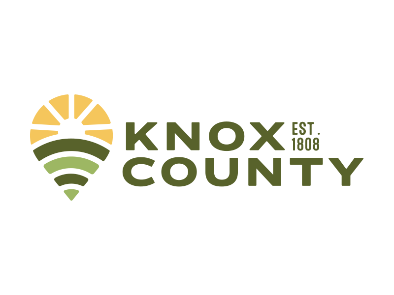
The new logo utilizes strong typography to help ground the icon graphic accompanied by a simplified pin-drop illustration of rolling hills, paved roads and sun rays to represent agriculture, history, and opportunities for growth and enlightenment.
Sun Rays
The sun rays at the top of the Knox County logo mark symbolize the opportunities that exist in the town. With budding small businesses, arts and craft classes and even the Mount Vernon University all being at the center of the concept.
Brick-Like Pattern
Brick streets, a quaint reminder of times gone by, are an important historical reminder of Knox County's roads. To give a nod to the history, the makeup of the logo mark combines the graphic pieces together in a modular, layered approach - much like brick stacking.
Rows of Green
We'd be amiss if we didn't include the agricultural side of Knox County. As one of Ohio's top agricultural sites, resulting in a majority of the town's workforce, we infused ribbons of fields towards the bottom of the logo mark. Using two different green hues, I layered these elements the way one would view fields in Knox County itself.


