Trex Academy
Improving the Trex Academy user experience by leveraging insights to streamline user flow, accessibility and an intuitive journey to content.
Client / Year
Trex / 2023
Role
UX Lead
Services
• Web Audit
• SEO Strategy
• Design
Notes/Credits
Created at Material+
CD / Diana Saez
Copy / Anne Parin
Context
Trex Academy is a space within the trex.com site curated towards the builders and DIYers of the world looking for tips and tricks to install a Trex deck or accessory. The space is a hub of information for getting started, beginning to build and adding finishing touches.
insights
What data revealed about the Trex Academy UX
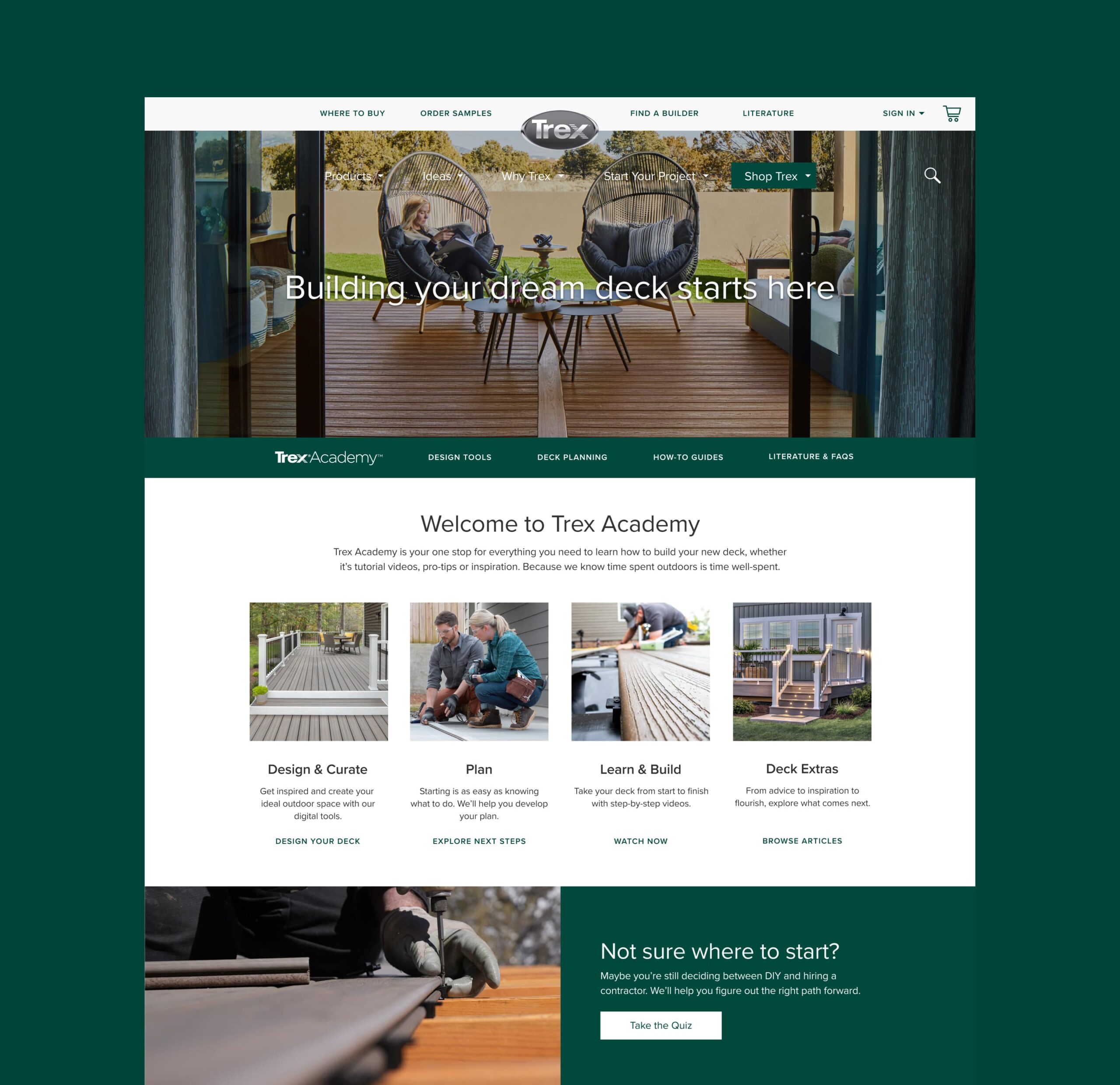
With the most individual page visits, least amount of page exists and natural placement as the gateway for all subsequent academy pages – the landing page was hugely underutilized with the existing layout and content. It even came out on top compared to the trex.com homepage, which was the second most visited page of entrance for the academy experience.
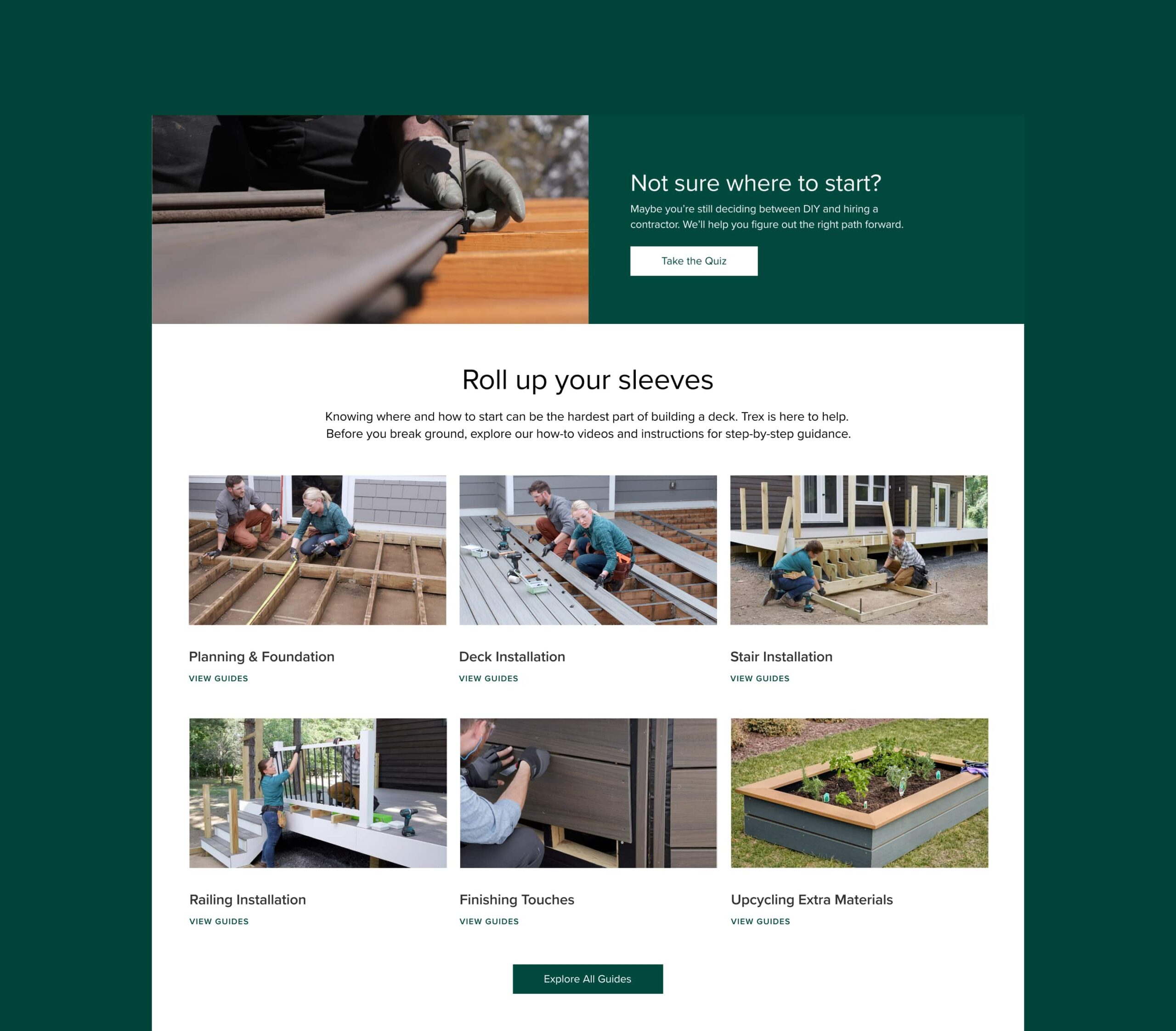
The video library pages combined were users’ most visited pages and their longest. While these weren’t the first pages individuals were landing on, they were the last and longest with an estimated 4 minutes per video page. With this, we learned there were a fair share of users prioritizing the how-to guides as their final and desired destination.
While the majority of users landed on the Trex Academy landing page, where they transitioned next was split into multiple options. From searching for more inspiration, to shopping for additional products, to learning what tools were needed – users were headed out of the experience. What we didn’t know, was if this was their intention or if they were unknowingly clicking links they thought would move them down the learning funnel.
problems
Audit Observations
Unintuitive Flow
The layout and navigation on the main landing page were not intuitive, hindering users’ journeys to the hub videos which we saw in limited direct access data.
Misleading Navigation
While the double navigation was unavoidable due to the dev limitations, the naming convention within the sticky NAV was misleading to users. For example, a link labeled “plan your deck” took users to the design tools landing page NOT to the next step within the academy experience.
Poor Mobile Experience
The academy experience was not optimized for mobile viewing, modules were not created for responsive layouts and often times made clickability difficult or inaccessible for users.
Inconsistent UI
Design decisions were applied inconsistently across pages. Call to action buttons had varying weights and visual treatments, typography hierarchy was inconsistent and misleading and color usage did not pass accessibility standards.
solutions
Consistent & Impactful Solutions
Beginner & Expert Friendly Options
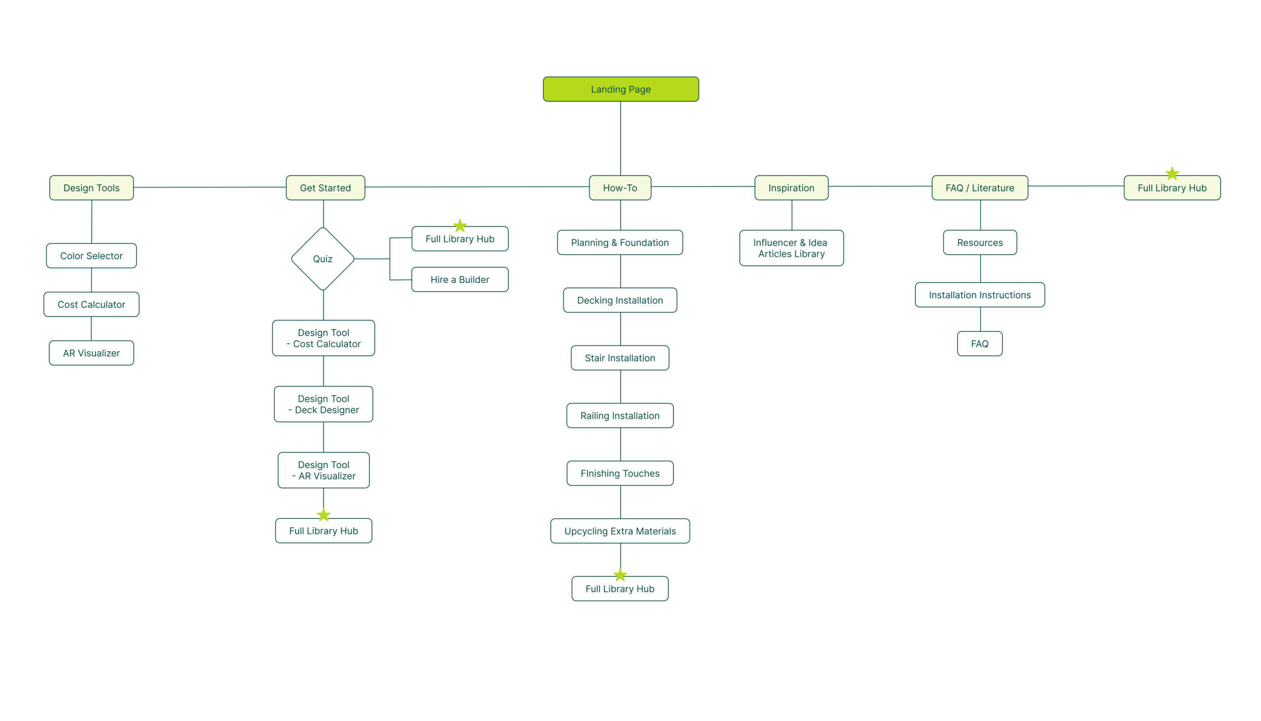
By clearly outlining modules in the planning and getting started stage to more hands-on building stages, we allow users to quickly navigate to the stage in the process most relevant for themselves.
Consistent Visual Design
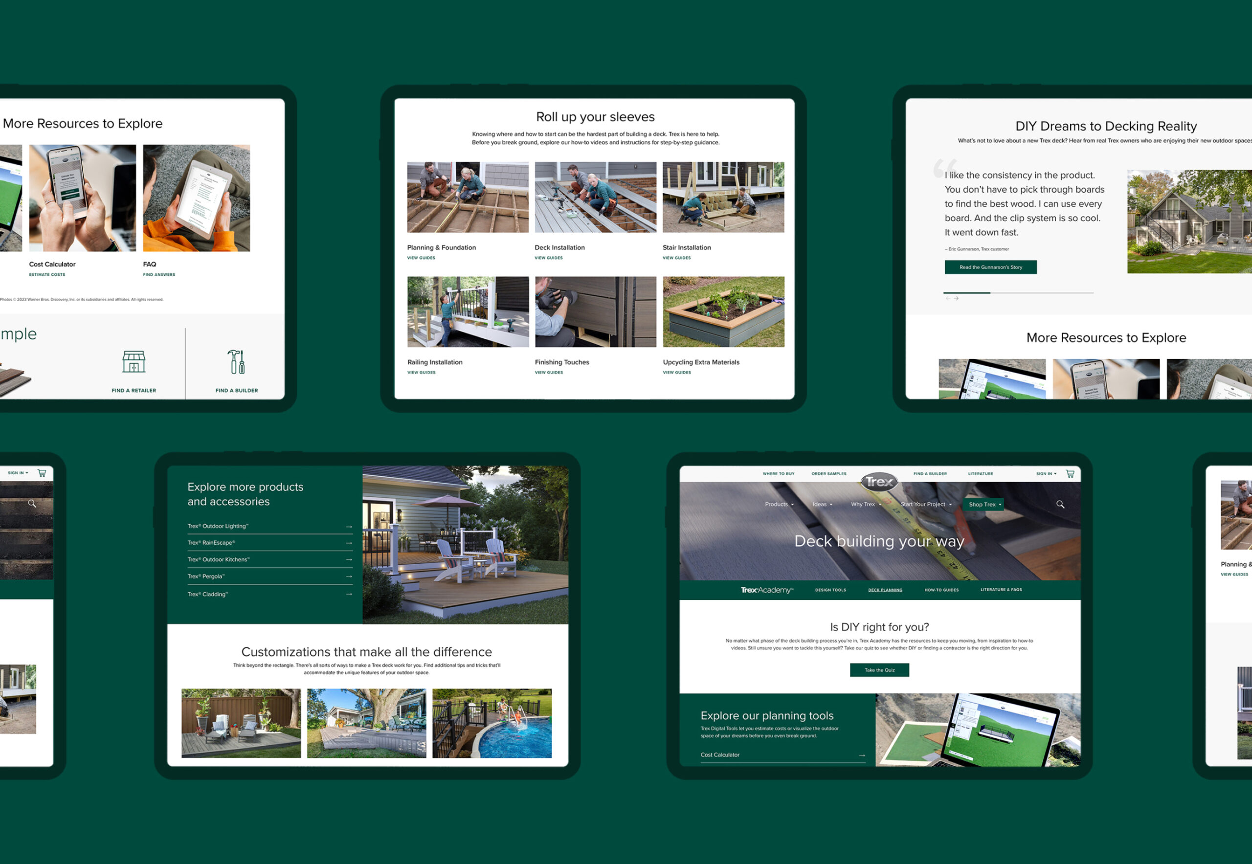
By creating a consistent brand ui library complete with type styles, color treatments, button styling and more – we outlined how visual elements should be treated across the academy experience. This also ensured all elements would pass accessibility standards.
Direct CTA Language
Our team identified the top and lowest CTA placements and evolved button language to more intuitively outline to users where their next step would take them.
Clear and Concise Flow
As we identified the three types of users and what their needs would be, we were able to create a user journey that not only supplied a direct path to educational content, but also answered their other needs along the way.
Direct Path to Hub Library
Knowing the video hub library was where our expert contractors were headed and where our other users would eventually end up, we included modules on each page for quick and easy access to the most visited how-to videos.
External Link Rules
While there were still user needs that proved worthwhile to keep external links within the experience, we adjusted how those links would open so they would always open in a new tab. This saved a user’s place within the experience so it would be easy to return to.
