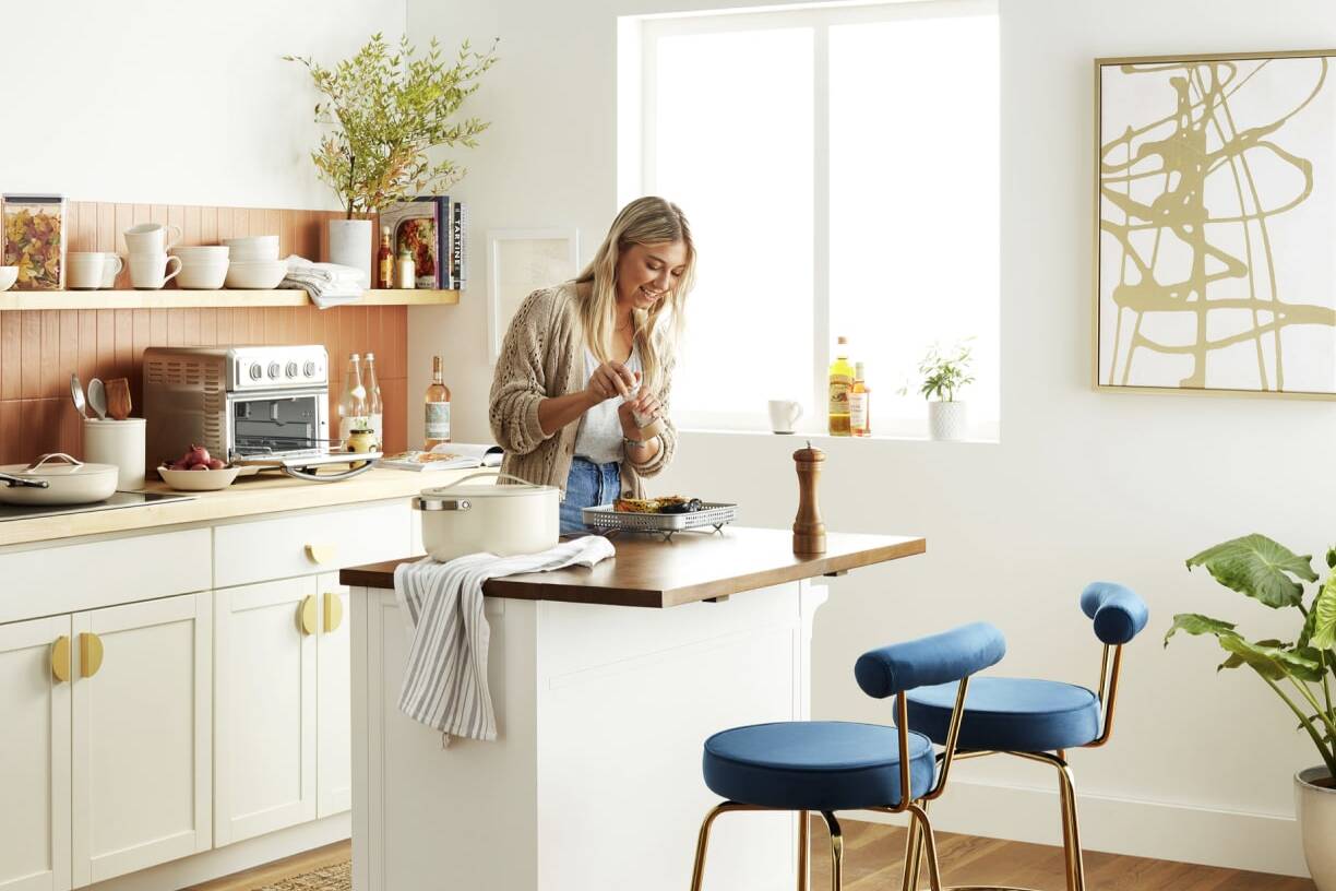
A comprehensive rebrand for Mermaid, including a refreshed brand identity, creation of a digital UI toolkit, and a full website redesign to elevate brand consistency and user experience.
Client / Year
Mermaid / 2024
ROLE
UX Lead
Art Director
Services
• Web Audit
• SEO Strategy
• Design
Notes/Credits
Created at Material+
CD / Allyson Mathers
Copy / Allison Burzloff
Context
The Mermaid brand is a subset of Wetwall and their larger mother brand, Wilsonart. The company at large specializes in high quality, low cost surface materials that span from countertops to wall panels. Mermaid itself specializes in waterproof bathroom panels that easily stick overtop tile, resulting in a quick, easy and beautifully renovated bathroom in as little as a weekend.
problems
Audit Observations
Poor Shoppability
The previous Mermaid site was built in a way that buried product links, buttons and PDP pages. Design options were difficult to sort and compare and purchasing locations were hard to follow and required external links to view availability at retailers.
Lack of User Specific Content
With Mermaid’s customer base being primarily the DIY audience, with contractors as the second, the site lacked content the audience would align and relate with. No examples, reviews, pull quotes or references for users to see real stories and real evaluations.
Poor Mobile Experience
The previous site was not optimized for mobile viewing, modules were not created for responsive layouts and often times made clickability difficult or inaccessible for users.
Inconsistent UI
Design decisions were applied inconsistently across pages. Call to action buttons had varying weights and visual treatments, typography hierarchy was inconsistent and misleading and color usage did not pass accessibility standards.
solutions
Consistent & Impactful Solutions
Thoughtful Homepage Content
Because the previous homepage was so limited with content, we needed more data to analyze our user’s needs. We set forth to include product examples, benefit highlights, real reviews and resources for installation support to track flow.
Benefit Focus
We infused benefit language and visuals throughout the website experience, always focusing on durability, beauty and ease of install – since we knew these were the three key areas our audiences would be looking at in their purchasing decisions.
Competitor Analysis
By analyzing our competition, we were able to come up with charts and figures on how the Mermaid product outshined in pricing, ease of installation, durability and more. Which would be beneficial for both user audiences.
Consistent Visual Design
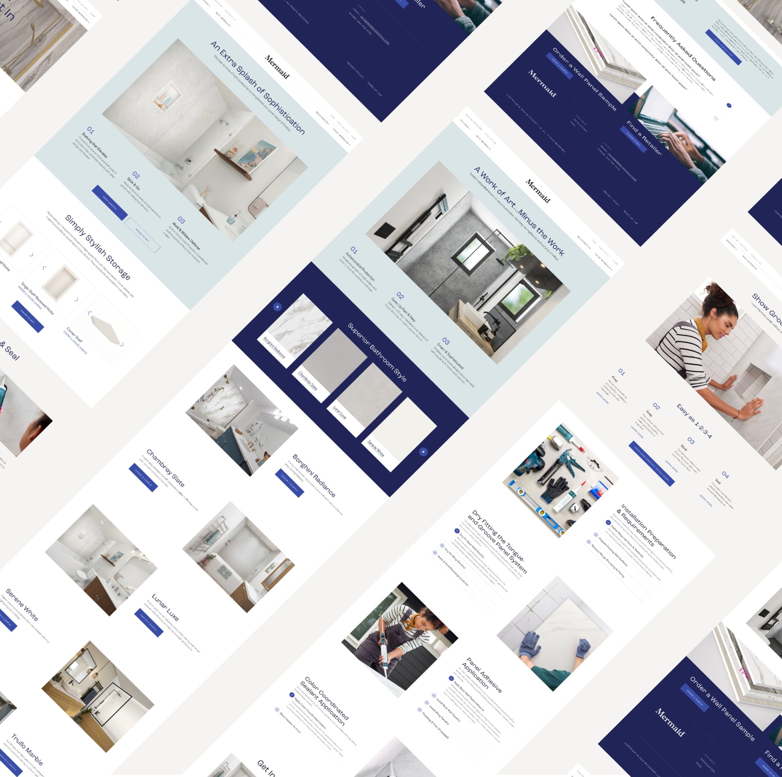
By creating a consistent brand ui library complete with type styles, color treatments, button styling and more – we outlined how visual elements should be treated across the academy experience. This also ensured all elements would pass accessibility standards.
Audience Focused Content
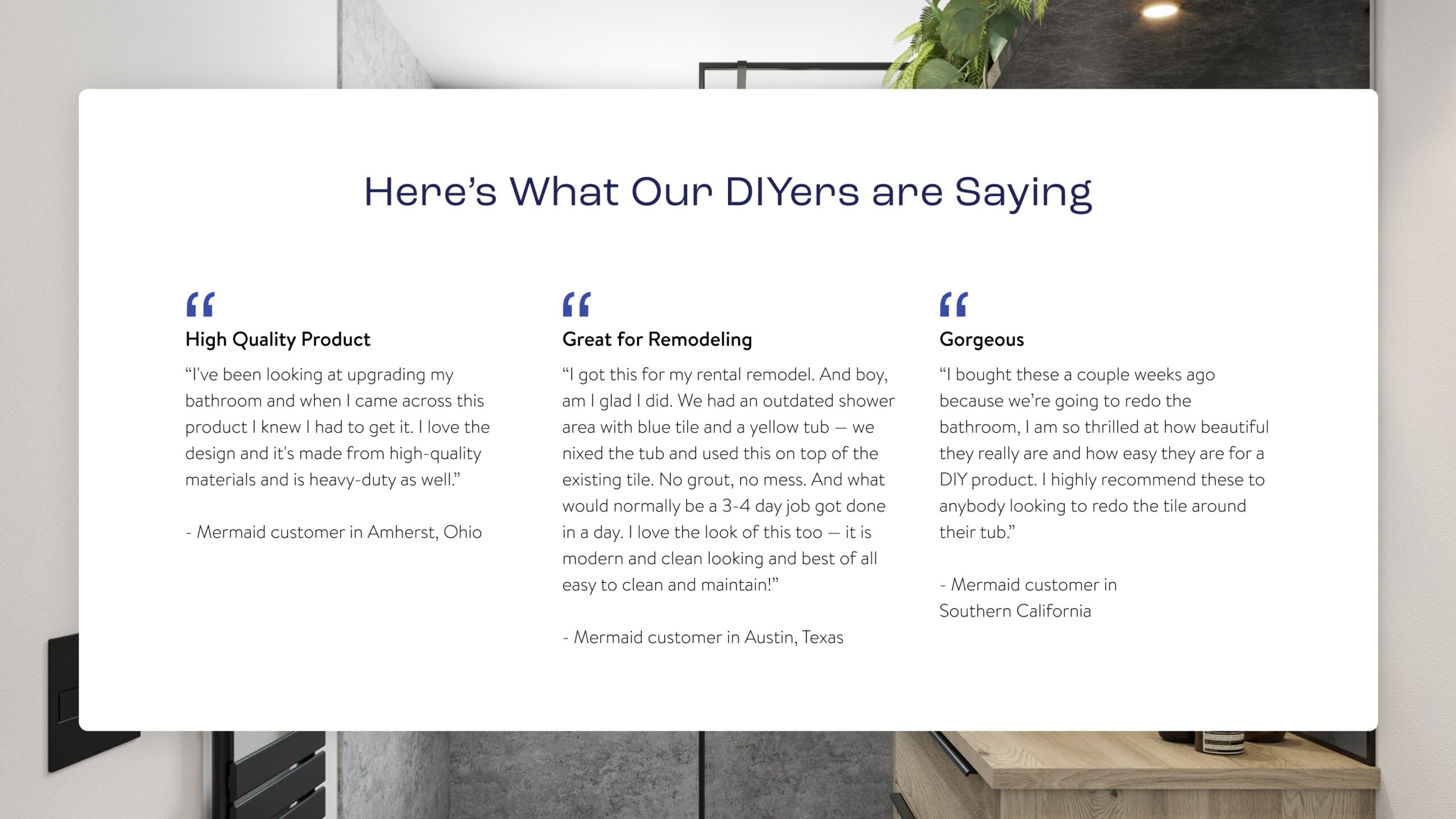
We pulled customer reviews from the retail purchase sites to be used as real-life stories. We chose to focus on reviews that highlighted the durability and installation efficiency for our construction audience and selected aesthetic and ease reviews for our DIY audience.
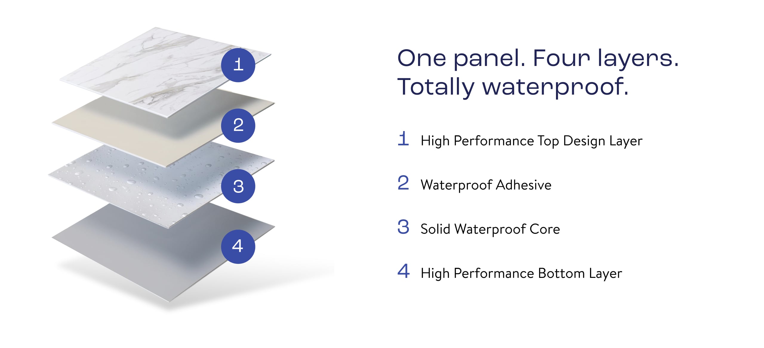
AI as Image Support
With a limited budget, photoshoots to build out the design library were out of the question. To remain scrappy and efficient, our team relied on internal photo retouching to create an image library that matched our elevated positioning while relying on AI to help us build out more tactile material and benefit assets.

